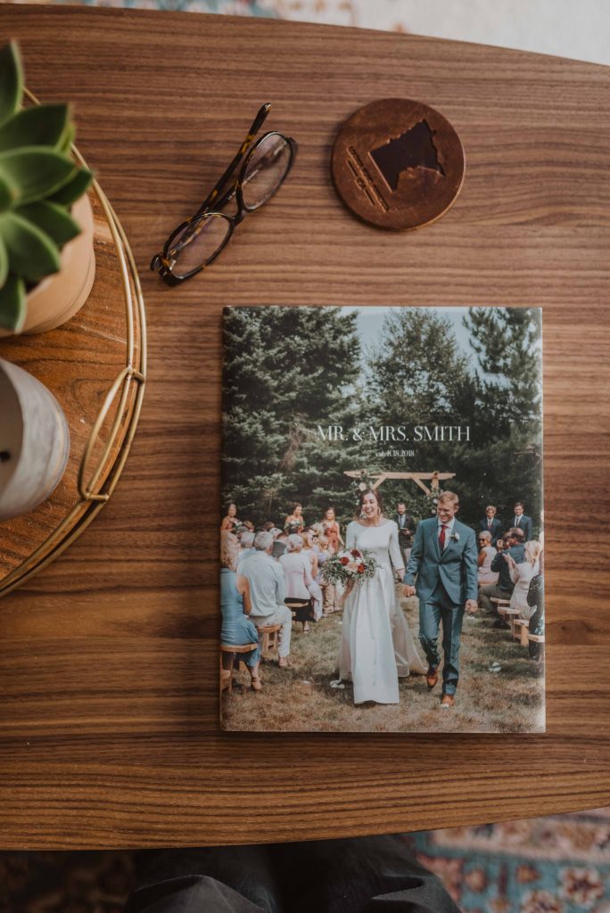
1. Narrow down your photos
This step will save you HOURS when it comes to designing your book. Before you do ANYTHING else, cull your photos. I recommend trying to choose 50 – 100 photos. (I know it’s hard!!)
As a photographer, I’m used to culling hundreds of photos and narrowing it down to a few favorites. However, I know it’s not easy! I recommend going through your photos twice:
The first time: go through quickly, don’t think about it too much and mark ALL of your favorites. (There are a few ways to do this, one easy & free way is to use the Photos app on a Mac or you can do this directly in your gallery!)
The second time: only focus on the photos you “favorited” and narrow it down even further. Take your time and decide which image is the strongest out of similar images. Make sure to include a few detail shots and some of the location to add variety to your book!
Choose the photos that move you. The ones that make you stop in your tracks
and bring you back to that moment.
After you’ve narrowed down your photos, create an album in your files with only these photos so that you can upload them directly to make your photo book.
2. Limit each layout to a few photos
When it comes to laying out your album, white space is good! Try to stick to a few photos per page. It will allow the photos to stand out more (rather than being lost in a collage of images).
Some layouts will have more photos than others and some might only have one — that is totally okay! Variety is good here.
Bonus tip: if you have a photo that you’d love to see blown up, try stretching it across your whole layout! (This works really well with Layflat Albums and makes a beautiful statement.)
3. Pair photos by color
This might be my favorite tip… don’t worry about going chronologically in your book! Instead, focus on paring similar colors and tones together.
If it’s an event like a wedding, you might want to keep it chronological, but you can still utilize this tip by scattering detail shots throughout your album (rather than having them all on one page) or adding in location shots or shots of guests at various points. The variety this adds to your album is stunning and makes it flow so well together!
4. Keep Font Size Small
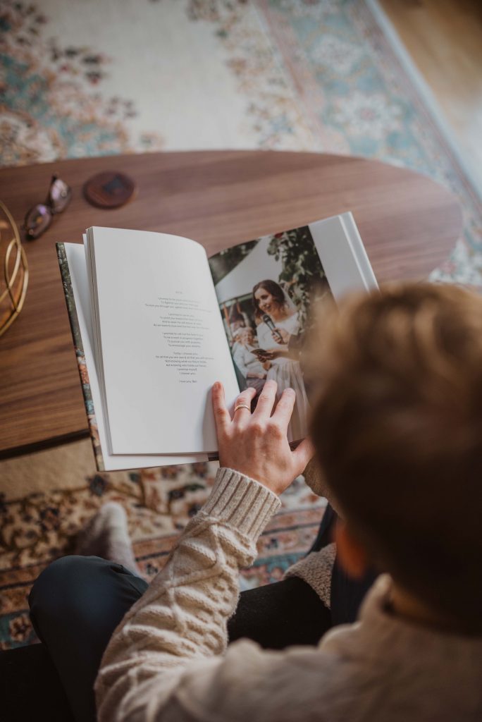
I recommend having little to no text in your book, as I’m a huge believer that photos can speak for themselves. HOWEVER, if you want to include your vows, your first dance song, or something meaningful like a snippet of your dad’s speech, my answer is always and forever a resounding YES. Ben and I wrote our own vows for our wedding and I LOVE getting to re-read them over and over in our wedding album.
If you do choose to include text, my main recommendation is to keep text small (so you don’t distract from the photos) — like under 12pt. My personal go-to is either 10 or 11pt (depending on the font), because it’s most similar to the size you’d see in coffee table books or magazines.
5. Make the Investment
My suggestion is don’t go cheap when it comes to designing your album. This is something you will treasure FOREVER. It’s priceless, truly. It may seem expensive, but I promise, it’s worth it to invest in quality — quality binding, quality paper, quality printing.
I’ve tried printing from several different companies, and my ABSOLUTE favorite is Artifact Uprising. Their quality and design is unbeatable.
For wedding albums, I recommend THIS package. It includes 1 Full Size album (for you and your significant other to keep) and 2 additional albums for parents! AND because you purchase as a bundle, you save some money.


